![]()
![]() Part 2 of 2 articles
Part 2 of 2 articles
In part one of this series of articles I told the story of the design of the new Arabic logo for Iqra magazine. This article tells the design story of Iqra's English logo. A story that started about four thousand years ago.
When Iqra's Editor asked me to design a new logo for the cover of this
magazine, he placed only two requirements 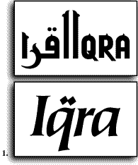 on me: the new
logo should have an Islamic character, and should include the word "Iqra"
in English. For the last twenty years or so, I have been exploring the possibilities
of compatible Arabic/English graphic and calligraphic design, where the
visual appearance of both languages is compatible and in harmony. So It
was natural to start this assignment by trying to design a new logo that
combined both Arabic and English in one design. After several sketches in
this direction, as for example in figure 1 top, I decided to make the English
word distinctive from the Arabic in style, but related in different, more
subtle ways, that go beyond the direct visual appearance of the two scripts.
on me: the new
logo should have an Islamic character, and should include the word "Iqra"
in English. For the last twenty years or so, I have been exploring the possibilities
of compatible Arabic/English graphic and calligraphic design, where the
visual appearance of both languages is compatible and in harmony. So It
was natural to start this assignment by trying to design a new logo that
combined both Arabic and English in one design. After several sketches in
this direction, as for example in figure 1 top, I decided to make the English
word distinctive from the Arabic in style, but related in different, more
subtle ways, that go beyond the direct visual appearance of the two scripts.
A Search into the Origins: Arabic belongs to the group of Semitic
alphabetical scripts in which mainly the consonants are represented in writing,
while the markings of vowels (using diacritics) is optional. "The earliest-known
[phonetic] alphabet [to mankind] was the North Semitic, which developed
around 1700 B.C. in Palestine and Syria. It consisted of 22 consonant letters.
The Arabic, Hebrew, and Phoenician alphabets were based on this model. Then,
around 1000 B.C., the Phoenician alphabet was itself used as a model by
the Greeks, who added letters for vowels. Greek in turn became the model
for Etruscan (c. 800 B.C.), whence came the letters of the ancient Roman
alphabet, and ultimately all Western alphabets" (Note 1, fig. 2). Knowing
that the letters of the English word came originally from the Arabic alphabet,
or the same origin as Arabic, I felt that a deeper understanding of the
qualities of the Arabic word and 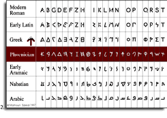 letters was in order.
The word Iqra is made up of the three Arabic letters, Alef, Qaph, and Ra; the Alef is repeated at the beginning and at the end of the word. Alef is the first letter of the alphabet, and also the first letter of the word Allah (SWT). It has the numerical value of 1, or Ahad and Wahid, both names of God meaning The One and The Unique. The other two names of God that start with Alef, Al Awwal (The First) and Al Akhir (The Last), make Alif the embodiment of the whole alphabet, and consequently all knowledge.
The Roman letter 'Q' started its life as the Phoenician letter 'Qoph',
the same Arabic letter 'Qaph', a word meaning the back of the head where
it is connected to the neck, and represented by a simplified shape of a
head and neck (fig. 3). Qaph is the 19th letter of the alphabet and
has the numerical value of 100. It signifies the 'light'. The names of God
that start with Qaph are associated with the qualities of power:
Al Qahhar (The Subduer), Al Qadir (The Able), Al Qawi
(The Most Strong), Al Qayyum (The Self-Subsisting), Al Quddus
(The Holy), and Al Qabid (The Constrictor).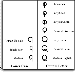
'Ra' is the 20th letter of the alphabet and has the numerical value of 200. It is abbreviated form the word 'Ras', meaning head, and was written as the profile shape of a head. Ra represents 'recognition', which comes as the natural consequence after Qaph, both figuratively and symbolically. God's names that start with Ra are associated with the qualities of mercy and compassion: Al Rahman (The Beneficent), Al Rahim (The Merciful), Al Razzaq (The Provider), Al Rafi' (The Exalter), Al Ra'uf (The Compassionate), Al Raqib (The Watcher), Al Rashid (The Guide to the Right Path).
Detecting the Connections: The Arabic alphabet has 28 letters, and uses only 18 letter shapes to represent these letters. In other words, several letters share the same character shape. In the early years of Islam these different letters were only occasionally differentiated from one another by dots. However, with the expansion of the Muslim Umma, and the increasing number of non-Arab Muslims, there was a greater need for facilitating learning of Arabic, to insure that every Muslim has an equal opportunity to read the Holy Quran correctly. Towards this end, a system of Naqt or I'jam (letter-pointing), and Tashkeel (vowel indication) was developed (fig.4).
Two students of Abul Aswad al Du'ali, the legendary founder of
Arabic grammar, Nasr ibn Asim (d. 707) and Yahya ibn Yamur
(d. c. 708), were requested by the Ummayad governor al Hajjaj ibn Yusuf
al Thaqafi to codify and elaborate on earlier attempts to use dots to
distinguish letters. The governor took it upon himself to enforce the system
which we still use today (Note 2).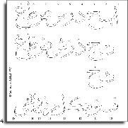
The influence of Arabic calligraphy on Europe was clearly manifested in the development of the Blackletter style during the Middle Ages, and reaching its peak in the fourteenth century. The lower case letters, were written using closely spaced vertical strokes that imitate the Arabic Kufi style. And while the Blackletter style is used until now in traditional and religious works, and in formal certificates, diplomas and awards, a more prevalent influence of Arabic aesthetics on Western scripts is the addition of the dots to minuscule letters 'i' and 'j'. These letters did not have dots when originally developed with the lower case or minuscule alphabets in the ninth and tenth centuries, nor any dots existed in the Roman majuscule letters before that (Note 3). Since there is no real need for these dots in the Roman alphabet, because each letter shape corresponds to only one letter, I would argue that their addition around the thirteen century was an attempt to further borrow the visual qualities of the Arabic alphabet.
Back to the Present: So when I wanted the short word 'Iqra' to express in its appearance the complex and multifaceted relationships between Arabic, the language of Islam, and English, the language of our predominantly European culture, I chose a calligraphic typeface, and added the two dots of the Arabic Qaph to its English distant descendant, the letter Q. I felt that the long process of intellectual development and exchange, which started at least four thousand years ago, can be summarized by the simple act of putting the dots on the letters.
Notes:
1. David Crystal, The Cambridge Encyclopedia of Language (Cambridge
University Press, 1987), p. 202.
2. See Y. H. Safadi, Islamic Calligraphy, Shambhala Press, Boulder
1979, pp. 13-14.
3. For examples of these styles please see The Speedball Textbook, A
comprehensive guide to pen and brush lettering, 22nd edition 1991, Hunt
Manufacturing Co., pp. 26-29.
Fig. 1. An early design for Iqra logo incorporating Arabic and English
in a compatible arrangement, and the final design in English with Arbic
dots.
Fig. 2. The Arabic and Phoenician alphabets, along with several other alphabets
such as Hebrew and Aramaic, are based on an early model called the North
Semitic. The Phoenician alphabet was adapted by the Greeks, then the Etruscans
and Romans, and eventually became the Western alphabet as we know it today.
Fig. 3. The historic development of the Roman letter 'Q'. The creation of
the lower case form, 'q', made the letter shape more similar to Arabic.
Fig. 4. Several letters in the Arabic alphabet share the same shape, and
are differentiated only by the number and placement of dots on the letters.
Of the basic 18 shapes, 2 are used for three letters, 6 are used for two
letters, and the remaining 10 are used for one letter each.
Article and figures © copyright 1993 by Mamoun
Sakkal
Part one tells the story of the design of the Arabic part of this logo.
![]()