![]()
Part 1 of 2 articles
We are exposed to hundreds of visual images every day, at work and at home, in print and on screen, while shopping, reading, traveling or playing. These images build our aesthetic sensibilities, affect our behavior, and form a part of our personality. As Muslims, we should make a conscious effort to balance these images with ones of Islamic character.
One area where this need is obvious is when we want to identify a product,
a service, or an organization with a logo that communicates its personality
and conveys a certain impression about what it is or what it does. When
providing design services to many Islamic organizations and publications
I try to convey an Islamic image using contemporary vocabulary. It is my
belief that we can, and should, learn a great deal by studying the impressive
heritage of our ancestors, and by practicing the traditional Islamic arts.
The need to embrace our traditional arts is more crucial now than ever because
of our continuous exposure to the powerful media images of a different culture.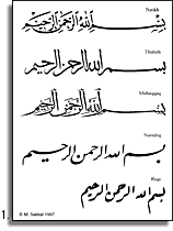
Arabic Calligraphy
For nearly 14 centuries, calligraphy has been a very important, if not
the most important, medium in the arts of the Arab and Muslim cultures.
Because Muslims believe that the Quran is the word of God revealed to His
prophet Muhammad (s.a.w.), and because the Arabic alphabet is used to fix
His word, great care and energy were expended to make the written word worthy
of such honor. Consequently, a beautiful script to write the Quran was developed.
Islam is the faith of unity, and the most obvious art form that expresses this unity is the calligraphy of Arabic script. The extensive use of calligraphy in Islamic art is due in part to the discouragement of representational art and sculpture.
From its simple early examples of the 5th and 6th centuries AD, the Arabic
alphabet developed rapidly after the rise of Islam in the 7th century into
a beautiful form of art.
The two main families of calligraphic styles were the dry styles, generally
called the Kufi or Kufic, and the soft cursive styles, which include Naskhi,
Thuluth, Nastaliq, and many others.
The Kufic styles, which reached perfection in the second half of the
eighth century, attained a pre-eminence that lasted for more than three
hundred years. In fact, it was the script used for copying the Quran. Because
of its monumental and bold geometric shapes, Kufic was also used in architecture,
sometimes with elaborate geometric or vegetal embellishments. 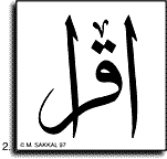
Cursive scripts coexisted with Kufic and date back to before Islam, but
because in the early stages of their development they lacked discipline
and elegance, they were usually used for secular purposes. In a slow but
continuous process, older styles were perfected, while new styles were invented
to meet the demands of different occasions.
Under the Umayyads and Abbasids, court requirements for correspondence and
record keeping resulted in many developments to the cursive scripts, and
several styles were devised to fulfill these needs. Abu Ali Muhammad ibn
Muqlah (d. 940) became an accomplished calligrapher in Baghdad at an early
age, and was a Vizir to three Abbasid caliphs. He is credited with developing
the first script to obey strict proportional rules. His system utilized
the dot as a measuring unit for line proportions, and a circle with a diameter
that equals the Alef's height as a measuring unit for letter proportions.
Ibn Muqlah's system became a powerful tool in the development and standardization
of cursive scripts, and his calligraphic work elevated the previous cursive
styles into a place of prominence, and made them acceptable as worthy of
writing the Quran. 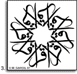
The most widely used cursive styles nowadays are the Naskhi which was
developed in the tenth century; Thuluth, the impressive, stately calligraphic
style which was often used for titles or epigrams rather than lengthy texts;
and Nastaliq developed in Iran in the fourteenth century. The traditional
classification of the main styles includes Muhaqqaq, Rayhani, Tawqi, which
are less used now, and the Riqa, the simpler style of everyday writing (fig.1).
(For more information on Arabic script and calligraphy styles please see
Art of Arabic Calligraphy articles).
Designing Iqra Logotype
The important role of calligraphy in Islamic art, and the emphasis on
writing and reading implied by the meaning of the name, made calligraphy
the natural choice for designing a new logo for Iqra magazine. The new logo
was to give a distinctive image and an Islamic quality to reflect the personality
of the publication, and mark the new stage of moving from a newsletter into
a mature magazine.
Because of its formal, cultural and aesthetic qualities, I chose Thuluth
as the appropriate style for writing the word Iqra (fig. 2). Thuluth is
a graceful and fluid style, its execution requires discipline, skill, and
care. Its line movement conveys a clear sense of order and a high standard
of beauty. Thuluth calligraphy is distinguished by its beautiful and elaborate
compositions, where two or more lines of text overlap in balanced and pleasing
arrangements to produce squares, circles or other shapes. This style appeared
around the tenth century, and developed steadily until the fifteenth century
when it reached its most elegant form under the Ottoman calligraphers, whose
work and aesthetics still influence us today.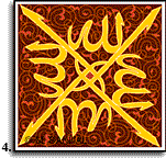
Calligraphy is an art and a craft that depends in its execution on the skill of the hand and the discriminating faculties of the mind. Using a pen on paper, the most direct expression of the artist's hand is achieved, while in a printed piece the calligraphy becomes a design that would be transferred onto another surface. The calligraphy must be digitized and its outline drawn through a lengthy process before its final beauty is revealed.
After the word Iqra was written, I used it as a basis to create several symmetrical designs, one such design is shown in figure 3. The chosen design for the final logo, however, is inspired by a composition of the word "Allah" used traditionally on wooden Quran stands (fig. 4). This composition of four related words evokes the shape of the stand itself when open, similar to a letter X, inviting the believer to recite form the Holy Book it so lovingly holds. The Metropolitan Museum of Art in New York has a magnificent example of these Quran stands in its collection of Islamic art, made in West Turkestan by Hasan ibn Sulaiman of Isfahan, and dated A.H. 761 (A.D. 1359).
The completed design for Iqra magazine conveys a sense of unity and dynamism
in the same time, its balance and energy reflect those of the magazine and
the organization behind it.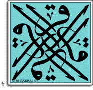
Beyond this Design
Muslims should learn to use the new technologies in publishing and graphics
without replacing replacing their visual consciousness and heritage in the
process. We should encourage the highest standards of creativity, quality,
and professionalism, without associating these values with European forms
of visual communication.
Muslims in North America, like those in other places, can not build a whole
and healthy community without encouraging the development of a visual language
that reflects our unique identity, both within our community, and while
dealing with other cultures around us. I hope that my logo design for Iqra
will serve as another step in the journey towards achieving this goal.
Recognizing the importance of Arabic calligraphy and its role in enhancing
Islamic publications, I have developed a collection of calligraphic designs
for both IBM compatible and Macintosh computer users. The collection contains
traditional as well as modern designs. Please refer to IslamiClip section
for further details and ordering information.
Article and figures © copyright 1993 by Mamoun
Sakkal
Part two tells the story of the design of the English part of this logo.
![]()