
GRAPHIC DESIGN AND ILLUSTRATION
GRAPHIC DESIGN AND ILLUSTRATION
Variations on M. C. Escher’s Name in Arabic Script |
|
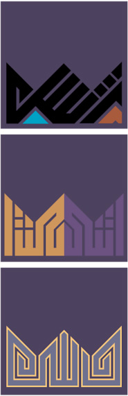
Variations No. 9-11Variations “9,” “10,” and “11” are based on tiling diagrams from Escher’s Sketchbook of “Abstract Motifs” of 1941 which he titled as “Regular division of the plane by similar figures of which size and contents rhythmically diminish in size, receding toward the center.” [reproduced in Schattschneider, Doris, M.C. ESCHER: Visions of Symmetry. New York, Harry N. Abrams, Inc., Publishers, 2004, p. 91]. In each of these designs I explored a different way to write Escher’s name so it will fit the boundaries of the tiling unit. In variation “9” I turned the calligraphy 45 degrees so that the lines of the Square Kufi design are lined up with the angled sides of the titling unit. The final letter in this design, Re, has an extended tail which makes an additional spiral turn and wraps back towards the body of the word. The three dots of the letter Shin are stacked up one above the other instead of the traditional horizontal way as in variation “1” or the triangular way as in variation “2” and variation “10.” The name composition here did not fill the complete space and two additional lines were introduced to do that. These are colored in blue and pink in the diagram at left. In variation “10” the connection between the letters Shin and Re is extended and turned to the top and left at 45 degrees. The resulting form can be easily confused with the shape of another Arabic letter, Ye, so this design cannot be considered quite successful from the legibility point of view. The name is mirrored to form the other half of the design. This type of mirror composition is used occasionally in traditional Arabic calligraphy, and the resulting reflected word is written backwards and can be read only by analogy to its mirror image. In variation “11” the first letter, Alef, and the last letter, Re, are extended in a spiral way in opposite directions to form the outside triangles of the repeat or tiling unit. The position of the Alef as the shortest of the vertical lines in this variation is not successful because it is usually written taller than the following letters as in variation “2” for example. |
 |
 Previous Previous  Next Next  |
|
| Title Page | Introduction | Portfolio | Escher's name composition |
Project: Arabic calligraphy name design
Client: Artist's Market, Norwalk, CT
Designer: Mamoun Sakkal 2006

© SAKKAL DESIGN 1523 175th Place SE, Bothell, WA 98012, USA.