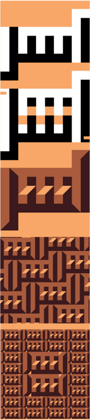
In the spring of 2005, Jeffrey Price asked me to do a calligraphic name design for M. C. Escher using the Arabic script. I had much interest in Escher’s art and decided to do the name following his own graphic style. I worked on this project for the next few months, and created not one, but many such designs. By the end of 2005 I completed my work and selected the best sixteen designs for this portfolio. After some interruption, I am delighted to have this project concluded and published now.
In order to give some insight into my design process, and to make the viewer more acquainted with Arabic calligraphy, I prepared the following analysis and commentary.
Variation No. 1
The name Escher is written in Arabic using three letters for the sounds E, Ch, and R. The vowels are not written in everyday writing so they are not used in these designs. The sound E is written with the letter Alef, the vertical line at the right end of the word since Arabic is written from right to left, and the specific sound for E is indicated with a small mark below the Alef that looks like English letter “c,” with a small horizontal line below it. This is because the Alef is also used for the sounds A and U when the small mark is placed over it instead of below. In early Arabic writing this little mark called Hamza was not written. Also not written in old Arabic of the Seventh and Eighth centuries were the dots that sit above or below some letters to indicate certain sounds. These dots are used because several sounds are written using the same basic letter shape and only later the different sounds were differentiated from one another in writing by adding these dots. The sound “Ch” is one such letter, and its basic shape is also shared with the sound “S” which does not have any dots.
To write Escher’s name in a tessellation where both the white and black space spells the name in the same manner I used an old style of Arabic calligraphy we call today Square Kufi or Kufic. This style is distinguished with its uniformity and regular, geometric shapes that allow for an interlocking design.
In this style we usually don't use dots or other marks as shown on top (a.). But because the name Escher is not a familiar Arabic word I opted to add the dots so it is easier to read. Adding the dots and the Hamza exposes parts of the background as gaps in the design (b.). To minimize the effect of this problem I squeezed the symmetrical names closer to each other and turned the gaps into trapezoid shapes that recall the three dimensional visual illusions common in Escher’s work where one shape changes into another (c.) I used the same 45 degrees treatment to avoid extending one color into the boundary of the other which allows me to create tessellations where the adjacent colors are always different. This basic unit is used to create a number of tilings that fit the space perfectly (d.), but I opted to revise the design in order to make the two positive and negative words fit into a double square which is used to create the final piece of artwork included in this portfolio. |