![]()
© Huda Smitshuijzen AbiFares 1998
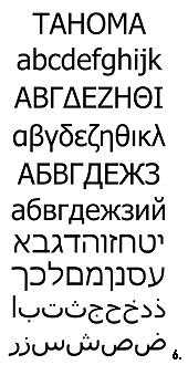
Fig. 6 - Monotype was recently commissioned by Microsfot to extend the Tahoma
font to include Arabic and Hebrew, a (Latin) font designed by Mathew Carter
specially for MicrosoftCorporation. Tahoma is meant to be a highly legible
on-screen system and web font, for Windows NT systems. Tahoma which is supplied
as a TrueType font, has been throroughly hinted by Monotype to maximize
on-screen legibility, specially at small sizes. Tahoma(tm) is a trademark
of Microsoft Corporation.
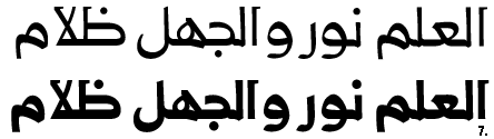
Fig. 7 - Mamoun Sakkal designed the font Al-Futtaim with a special attention
to the needs of signage and environmental graphics as well for use for digital
reproduction. This font solves the problem of long ascenders and descenders
and opens up the inner forms within letters. It creates a clear, sturdy,
and highly legible effect without losing the fluid calligraphic feel that
is so typical of Arabic Type. However, the font manges to give a contemporary
impression while carrying the seed of the calligraphic tradition in its
line quality. It contains a balance between pragmatic visual restrictions,
aesthetic concerns, and creativity in the design solution.
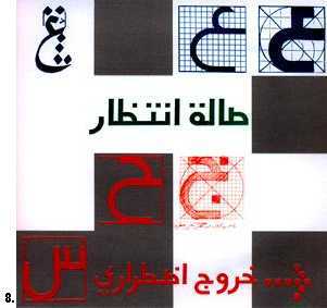
Fig.8 - Detail from a poster showing a design study for an Arabic stroke
font, for special use on signage. From a series of exhibition posters on
Arabic type design by Rayan Abdullah, Iraki senior designer at MetaDesign
in Berlin.
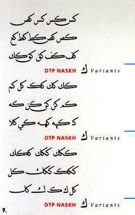
Fig.9 - Some Arabic letters and their traditional ligature sets and possible
Kashida swashes. Details from a poster/ typespecimen sheet for the Decotype
Professional Naskh font.
Fig. 10-12 - Ziad Kadri. 1996. Research project on Arabic type. The graphic design program at the American University of Beirut.
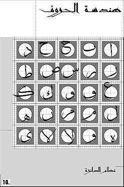
Fig. 10 - The Daairah system, shows the structure of each letterform in
relation to the letter "aleph" using the circle as a unit.
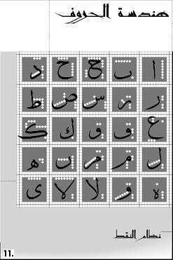
Fig.11 - The Nokat system, shows the structure of each letterform in relation
to the letter "aleph" using the "point" as a measuring
unit.
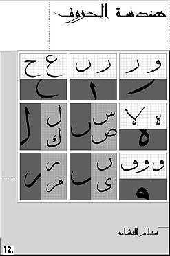
Fig. 12 - The Tashaboh system, shows the similarities between different
parts of some letters.
________________________________________
| Back to Article: Arabic
Type: a challenge for the 2nd millennium |
| Side notes: Comparison of Latin and Arabic
scripts | End notes | Bibliography
|
| Arabic Calligraphy |
![]()